


How Light Affects Colour
By Sophie Hardy, 6th April, 2017
Colour is described as the reflection or emittance of light from an object. This means that the type of light you use and the natural daylight coming into your home will have an effect on your colour scheme. There are a variety of factors to consider to get the right combination of colour and light, as not only will it affect the appearance of the room, but it will have a psychological effect on your mood too. In this article we discuss the colour temperature of light, how it is measured, and how it has a dramatic impact on your interior.
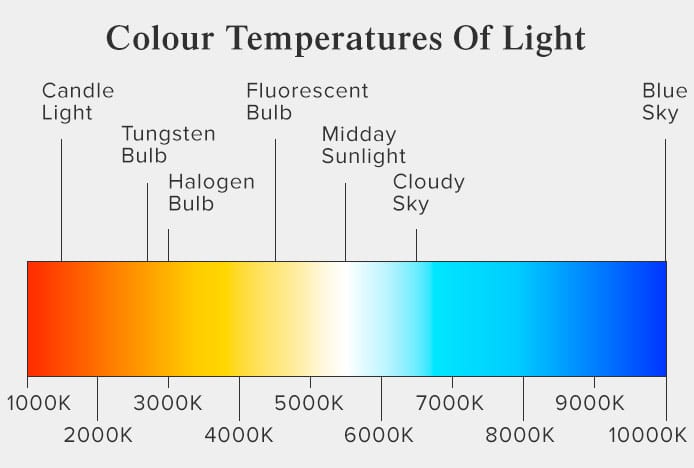
Fig. 1
Colour temperature is measured in degrees kelvin (K). The image above (Fig. 1) demonstrates the kelvin scale with some examples of light sources and their colour temperature. As you can see, the higher the kelvin rating the cooler (bluer) the light appears, and the lower the rating the warmer (more yellow) it appears. The kelvin scale applies to both artificial and natural lighting, and we discuss how each type can affect your interior below:
Artificial Light
Bulbs with a lower kelvin rating, such as traditional tungsten incandescent bulbs, will emit a yellowish glow, whereas a fluorescent bulb has a higher rating and will have a cooler whiter glow. LED’s come in various colour temperatures, from the warm yellow of a halogen bulb through to cool daylight. The incandescent bulb was once the only available option so its classic yellow glow was most common years ago. However, with the introduction of more energy-efficient bulbs and versatile LED’s, they are now less popular and may be phased out with new energy-efficient regulations.
It’s important to consider your colour scheme when choosing your lighting. For example, cream cabinets under a halogen bulb will intensify the cream and create a warmer and cosier appearance, whereas white fluorescent lamps on grey walls may look too clinical and cold. Your furniture may also be affected, and this could be anything from your kitchen table to your dining chairs, so we have demonstrated the possible outcome on a white chair in our example below (Fig. 2).
The fixture or shade surrounding your bulbs will also have an impact, as the light from the bulb will bounce off the inside of the shade and reflect its colour into the room. Your choice of bulb will also depend on its location, purpose, desired luminance and ambiance, for example you may opt for a brighter bulb in the kitchen to aid in food preparation.
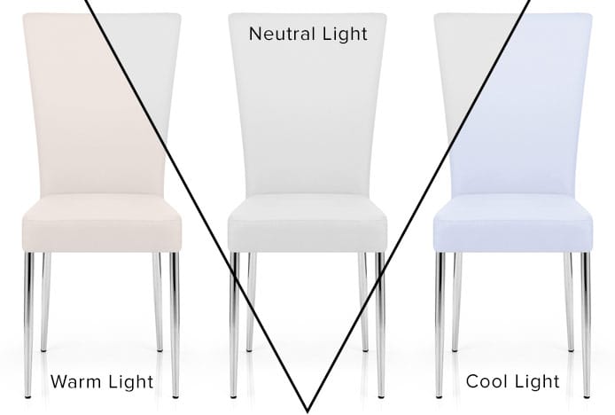
Fig. 2
Natural Light
As you may have noticed, a room lit with bulbs in the evening looks significantly different when the midday sun is streaming in through the windows. The colour temperature of this natural light changes throughout the day as the sun moves higher and across the sky, and it also changes with different seasons and weather throughout the year.
The midday sun characteristically casts a white light, whilst a cloudy sky has a cooler tint, and a clear blue sky has a blue cast. As the sun rises and sets the light becomes warmer, and these vast changes can alter the way your décor appears during the day. The immediate surroundings of the room can have an additional impact, as these surfaces will be reflected into the room through the window. For example, a grass garden outside may reflect a green shade into the room.
The main factors to consider when choosing your colour scheme and lighting are the direction of your room and the time of day you use it. We discuss these differences below.
Room Orientation & Colour of Light
It’s difficult to cater to every form of natural light, so you should decorate to suit the time of day the room is used most. Generally the kitchen is used mostly in the morning and evening, when making breakfast and dinner, which will be dark for a large part of the year. So you will need a bright well-lit room to see what you are doing when preparing and cooking food. There are also LED’s available with colour changing settings, so you could use these to create different moods at different times of day. Meanwhile, the dining room is used mostly in the evenings and so a single ambient setting would be sufficient.
The direction the room faces, or the direction the window lets in light from, will determine the colour of natural light for that room throughout the day:
North facing rooms get the least sunlight and can look cold and gloomy. You could embrace this with darker paint and furniture and then bring in warmth with halogen lamps for a cosy atmosphere. Or in the kitchen, use bold and punchy colours and LED’s with a high kelvin rating for a crisp modern look.
South facing rooms get the most even sunlight throughout the day, which is ideal for living rooms and means both warm and cool tones in your paint and furniture will be effective.
East facing rooms get a warm glow in the morning when the sun rises and then become cooler throughout the day, so you could opt for blues and greens in your décor to enhance the effect.
West facing rooms benefit from warm light in the evening when the sun sets. This makes them ideal for dramatic dining rooms, especially if choosing a palette with warm shades like red and orange.

Fig. 3
Colour Casts Created By Mixed Lighting
Even though we stress the importance of consistent colour temperature in your interior lighting, there will always be a contrast with any natural light entering the room. This is known in photography as a colour cast. The human eye can see this effect, but the brain naturally adjusts and balances any difference in colour temperature, so the real effect becomes clear when you photograph the room. Many interior photographers choose to turn the lights off when photographing to avoid this effect.
In our example below (Fig. 4) you can see there are three different colour temperatures coming from different sources; the halogen spotlights, the pendants, and the natural light. Looking at the floor, the overhead halogens are giving it a warm yellow appearance on the left hand side, and this becomes cooler as you look towards the window with the blue daylight. What’s more, the polished dark wood cabinets reflect and actually emphasise the warm appearance, demonstrating how different materials respond in different settings.
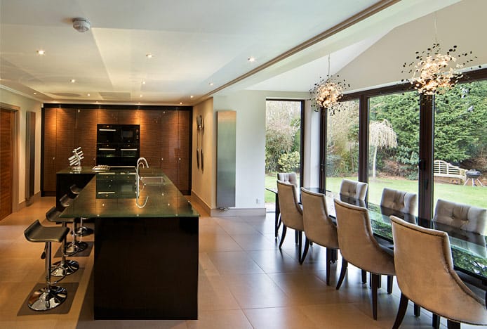
Fig. 4
Matte surfaces, like paint, coarse fabrics, and matte resin, will naturally absorb light and make colours look darker and muted, whereas glossy surfaces like ABS plastic, polished wood, and metal will reflect it and look brighter. They will also reflect their surroundings.
In the image below (Fig. 5), the top half shows the original colour casts, the bottom half has been colour corrected to replicate what the human eye would see. Firstly, look at the chrome frames of the two bar stools with their backs to us. They have a yellow tint that is reflected from the yellow lamps above, whereas the stools closest to the window are being hit with a blue tint from the daylight outside. This is also evident on the left, with the chrome kickboard, mini fridge, and oven. The yellow overhead light also hits the wooden floor and reflects its brown wooden tone up onto these mirrored metallic surfaces.
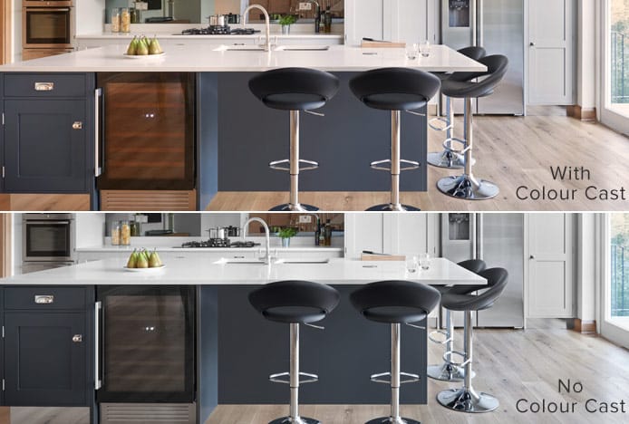
Fig. 5
So, when decorating a room make sure you test out samples of paints, fabrics, and surfaces at different times of day, under various lamps and bulbs, in corners and alcoves, and next to other colours in the room. You can also do this with different bulbs if they can’t be fitted until the room is decorated, which is often the case in the kitchen.
It’s also worth remembering that, to the human eye, brightness increases the saturation of colour so any colour under a direct light can appear more vivid. In contrast, less light can make colours appear duller. If you’re still unsure, an interior designer can help you pick out the best options for your room.
Recommended Articles
Marsala: Colour of the Year 2015
Colour of the year is Marsala- a deep red brown shade that's super sophisticated..
Radiant Orchid: Colour of the Year 2014
From furniture to fashion, exotic radiant orchid is the key colour of the year..
Theory of Combining Colours in the Kitchen
Not sure what colours to use in the kitchen? Let the colour wheel guide your decision..
Greenery: Colour of the Year 2017
The must-have colour of the year is Greenery, a fresh and revitalising shade..
Recent Popular Posts
6 Ways to Use Texture in Your Kitchen
Six easy ways that you can use texture to liven up your kitchen design..
How to Brighten up a Dark Kitchen
Whether your kitchen's a small space, or just poorly lit, brighten it up in 5 steps..
3 Easy Steps to Scandinavian Style in Your Home
Featuring natural materials, clean lines and light spaces, Scandi style is clean and cosy..
How to Create a Cosy Corner in Your Home
Staying in is the new going out! Pop the kettle on and relax in a cosy corner..