


Classic Blue: Colour Of The Year 2020
By Jack Morris, 7th February, 2020
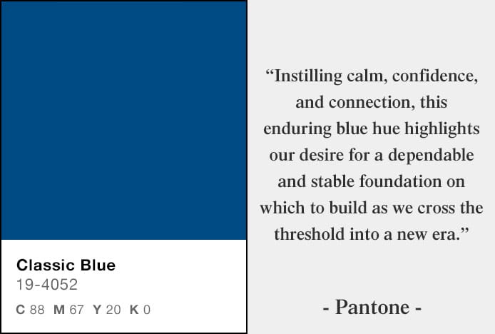
At the end of 2019, Pantone revealed Classic Blue as their Colour of the Year for 2020 – a prestigious achievement from a global authority on colour trends, signifying the importance of Classic Blue as part of the contemporary design and fashion scenes.
As is customary, Pantone has released the CMYK values (Cyan 88, Magenta 67, Yellow 20, Black 0) as well as the unique reference code for their top choice – Classic Blue 19-4052.
It’s perhaps unsurprising that a shade of blue has been chosen. After all, everyone from art historians to pollsters have noted the enduring and widespread popularity of this colour – the world’s favourite, according to a 2014 study by YouGov. In many parts of the world it is seen as representing immortality, in some religions it represents holiness, and it is incorporated into around 53% of the world’s national flags.
Anticipating a renewed interest in this superb shade, we’ve been ensuring the steady growth of our range of blue bar stools and chairs. To commemorate blue’s status as colour of the year, we’ve decided to look at how it can be used in the home, and which of our fantastic products is most likely to transform your interior for the better.
Psychology of the Colour Blue
Part of blue’s enduring popularity can be attributed to its wide range of positive connotations. Pantone note that Classic Blue impresses a sense of depth and possibility upon us, perhaps by inspiring comparison to the ocean or vast evening sky. For a similar reason, many shades have long been regarded as calming, and it has been found that shops with blue interiors tend to be more highly regarded among customers than with certain other designs.
Intelligence, productivity and clarity have also been associated with the colour, another factor in its use across business sectors. Rooms painted in blue, or incorporating a lot of blue elements, seem to help us to concentrate, and may also help in terms of creative output.
It also seems to be the case that different shades have different cognitive effects. While lighter hues of duck-egg blue are seen as especially friendly, darker shades such as navy or sapphire are more likely to evoke feeling of trust and reliability. As a result, it may be worth considering where and when to employ different variations in the home - perhaps an airier pale or powder blue for a children’s nursery and a deeper, more royal blue for a living area or bedroom.
Using Blue in the Home
There are many ways to use this versatile colour as part of your decor. One of the great things about it is that its time-honoured status doesn’t get in the way of its sense of contemporaneity, letting it infuse your home with simultaneous impressions of modern appeal and sophistication.
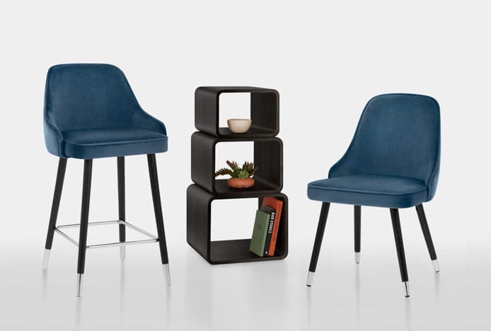
As noted earlier, blue is a colour often associated with peace, calm and tranquillity. As such, pairing blue-coloured walls, carpets and fixtures with similarly coloured furnishings may be a good way to instil a sense of easy relaxation. Our celebrated range of matching chairs and stools may be worth considering – as seen below, the Glam Bar Stool and Dining Chair are both available in a luxuriant shade of blue velvet that brings definite class and a serene quality to any interior.
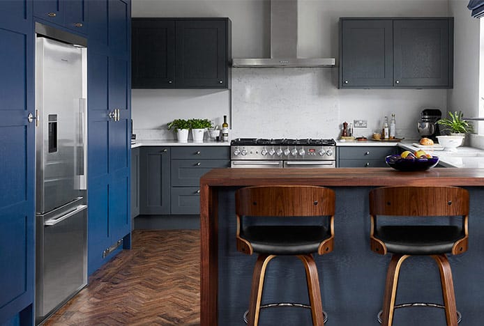
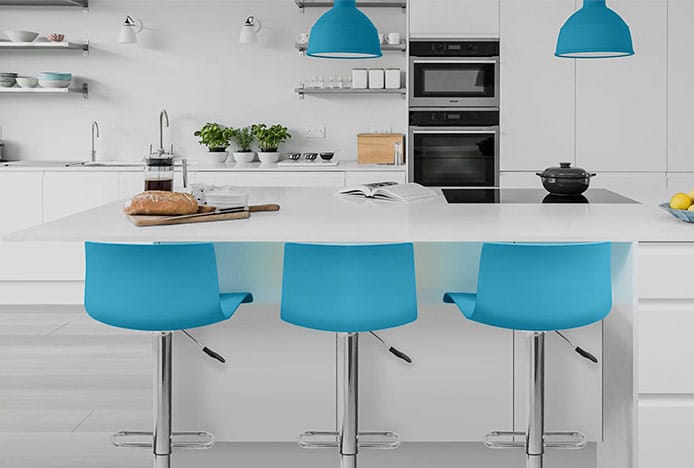
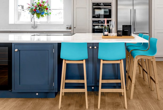
Given the range of different hues that are available, you may also want to consider mixing shades in your kitchen or dining area. Doing so can have a dramatic effect on the visual complexity of the space, adding depth to your interior. Perhaps try combining lighter walls with darker seats, units or worktops for a bolder, more stylish aesthetic.
Alternatively, try pairing blue furnishings with fixtures and appliances in similarly cool tones to provide a textured look. Chrome or brushed steel accents can make your room look even trendier by contributing to a modern-feeling colour palette, while grey and blue contrasts can be used to play with the relative warmth of your interior. The Serena Bar Stool Blue is one example, offering an eye-catching yet sophisticated pairing through its vivid ABS seat and polished, contemporary frame. However, we also stock a wide range of items in brushed and grey wood frame finishes that can have their own dramatics effect upon the feel of your workspace.
Failing this, you can achieve a nautical or beachside aesthetic by selecting certain tones and materials. Our range of breakfast stools includes the ever-popular Drift Oak & Blue, the rustic wooden frame of which adds a timeless sense of character. Additionally, a brightly complementing shade of yellow may provide a seasonal, summery atmosphere that will no doubt inspire guests.
History of the Colour Blue
Because vivid shades of blue are rarely found in nature, with some obvious exceptions, there seems to have been little in the way of depiction or consideration for this colour in early civilisation. Ancient Greek texts, including Homer’s ‘The Odyssey’, have been found to use terms such as ‘wine-dark’ to describe the ocean and other blue objects.
This began to change as we continued to experiment with new materials. The Egyptians began to create blue-coloured dyes from precious stones and minerals including lapis, though these dyes were still rare as a result of how expensive they were to make. On the other hand, this also made them popular with those who could afford them, and they were increasingly used in cosmetics.
Moving on to the Renaissance period, we see a continuing trend in the colour’s popularity. Ultramarine, an especially valuable pigment, was at times more expensive than gold and became a sought-after inclusion in some of the period’s most esteemed paintings and structures. It also became closely associated with the Virgin Mary, which may explain why this colour evokes feelings of trust and comfort to this day.
Over time, the colour blue became more common in art and clothing. A synthetic form of ultramarine was invented in 1826, and further developments in manufacturing and technology allowed cheaper, more readily attainable blue pigments to become even more widespread in fashion and interior design.
As a result, it is a generally accepted belief among historians that ‘blue’, as a word and concept, became more ingrained in human understanding once we began to develop blue dyes and pigments – in other words, our appreciation grew once we could make it ourselves.
Popular Blue Bar Stools & Chairs
-
 Drift Oak & Blue Velvet Stool
£109.99
-
 Glam Bar Stool Blue Velvet
£139.99
-

-

-
 Faro Bar Stool Blue Velvet
£59.99
-
 Sol Bar Stool Blue Velvet
£119.99
-
 Stitch Bar Stool Blue Velvet
£79.99
-
 Elle Bar Stool Dark Blue Fabric
£119.99
-
 Antonia Graphite Stool Navy Blue
£179.99
-
 Tucker Stool Antique Blue
£69.99
-

-
 Mason Bar Stool Antique Blue
£79.99
We’re often praised on our selection of bar stools and dining chairs, helping to make our customers’ kitchens, bedrooms and dining areas as fashionable as they are comfortable. For more ideas about using 2020’s Colour of the Year in your own home, why not take a look at our Blue Pinterest board.
Recommended Articles
Marsala: Colour of the Year 2015
Colour of the year is Marsala- a deep red brown shade that's super sophisticated..
Radiant Orchid: Colour of the Year 2014
From furniture to fashion, exotic radiant orchid is the key colour of the year..
Theory of Combining Colours in the Kitchen
Not sure what colours to use in the kitchen? Let the colour wheel guide your decision..
Greenery: Colour of the Year 2017
The must-have colour of the year is Greenery, a fresh and revitalising shade..
Recent Popular Posts
6 Ways to Use Texture in Your Kitchen
Six easy ways that you can use texture to liven up your kitchen design..
How to Brighten up a Dark Kitchen
Whether your kitchen's a small space, or just poorly lit, brighten it up in 5 steps..
3 Easy Steps to Scandinavian Style in Your Home
Featuring natural materials, clean lines and light spaces, Scandi style is clean and cosy..
How to Create a Cosy Corner in Your Home
Staying in is the new going out! Pop the kettle on and relax in a cosy corner..